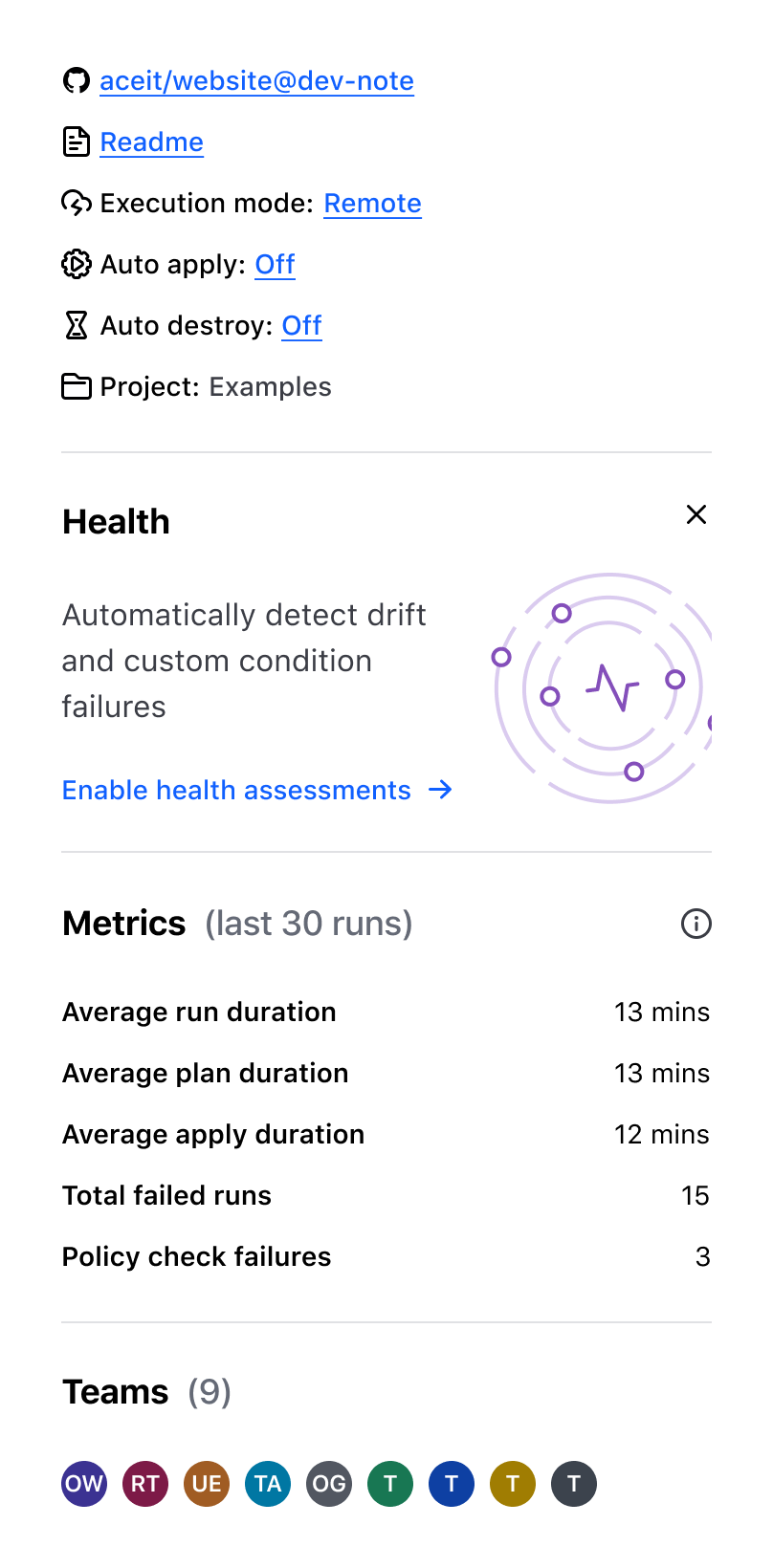
Placement
Use separators to distinguish between sections on a page visually. Use them sparingly and purposefully to avoid cluttering the UI and distracting users from the main content.
Use to create a clear break between paragraphs, blocks, or sections.

Don’t use to separate headings and body text. Instead, emphasize hierarchy by using the proper Display font style.

Spacing
We recommend using meaningful spacing between content elements, allowing users to scan and understand information quickly.
- Use the
0pxspacing option for a tightly integrated layout without any visible gaps between elements. - Use the
24pxspacing option to visually distinguish between different sections, making it simpler for users to navigate and understand the content.
How to use this component
The Separator renders a thematic break element (also known as horizontal rule, or <hr/> element) with equal top and bottom margins to create space between sections.
<Hds::Separator/>
Spacing
The default spacing value is 24 pixels. If you need to use the Separator without margins set @spacing to 0.
<Hds::Separator @spacing="0"/>
Component API
spacing
string
- 0
- 24 (default)
…attributes
...attributes.
Conformance rating
When used as recommended, there should not be any WCAG conformance issues with this component.
Support
If any accessibility issues have been found within this component, let us know by submitting an issue.